Best monitor settings for color accuracy

Learn how to get better color accuracy from our existing monitor without spending any money on a monitor calibration tool.
We've all been there: skies that turn purple, apples that look orange or the photographer's archenemy, prints that look too dark. We blindly trust our monitor colors only to later discover that our images looks off on other screens.
There's a dark art called color management that can fix those problems, but it comes with a cost: around $150 for a monitor calibration tool (Calibrite ColorChecker Display or Datacolor SpyderX Pro are both excellent) plus some investment in knowledge to get the most out of it.
Let me admit my bias up front: Hi, my name is Fabio and I'm a color nerd. Buying a monitor calibration tool is a must for any creative professional who depends on accurate color and I'd love to convince you of that.
But not all users have strict professional requirements and buying a colorimeter doesn't magically fix all problems, specially if your monitor is not set up right. On the contrary.
If we look up the reviews for the most popular hardware monitor calibration devices on Amazon we'll see a lot of angry users complaining about color casts and bad results overall.
A good part of those complaints stem from expecting too much from a bad monitor in the first place, or using the wrong monitor and calibration settings.
Instead of just saying "go out and buy one of those spider thingies", let's discuss briefly what is color management and how can we get better color from our monitors just by understanding and selecting the right settings.
Consider this guide as the first step for getting more accurate colors from your existing display. All these recommendations remain valid and will serve as a good starting point for a professional color calibration later on.
If you're in a hurry, jump straight to the recommended settings for better color accuracy on any display.
What is color management?
Color management is the process used to describe and translate color between different devices.
From camera to monitor to printer, any device that reproduces color can be measured and characterized by a color profile. This small bit of software can be used in a color management system to enable accurate color reproduction and match colors between other color managed devices, even if they're vastly different.
In practice: if you have custom color profiles for your monitor and photo printer, Adobe Lightroom can understand their differences and match their output as closely as possible, or simulate the printer output on your screen.
Better color without true color management
Adopting a color managed workflow requires measuring the color reproduction of all devices in the chain, beginning with the monitor. The only way of doing this is by using a hardware monitor calibration tool, either a colorimeter or spectrophotometer.
There's no way around it. Visual calibration tools, like those included on Windows, MacOS or free software like Calibrize, are very limited since they rely on our eyes for the correction and everyone perceives color differently.
This leaves us with two different strategies:
1) Adopt a color managed workflow
First one, and what I'd recommend, is to adopt a partially color managed workflow, starting with a properly calibrated LCD monitor with an IPS type screen. The least expensive monitor calibration tools I recommend are the Calibrite ColorChecker Display (in-depth review) and Datacolor SpyderX Pro (in-depth review).
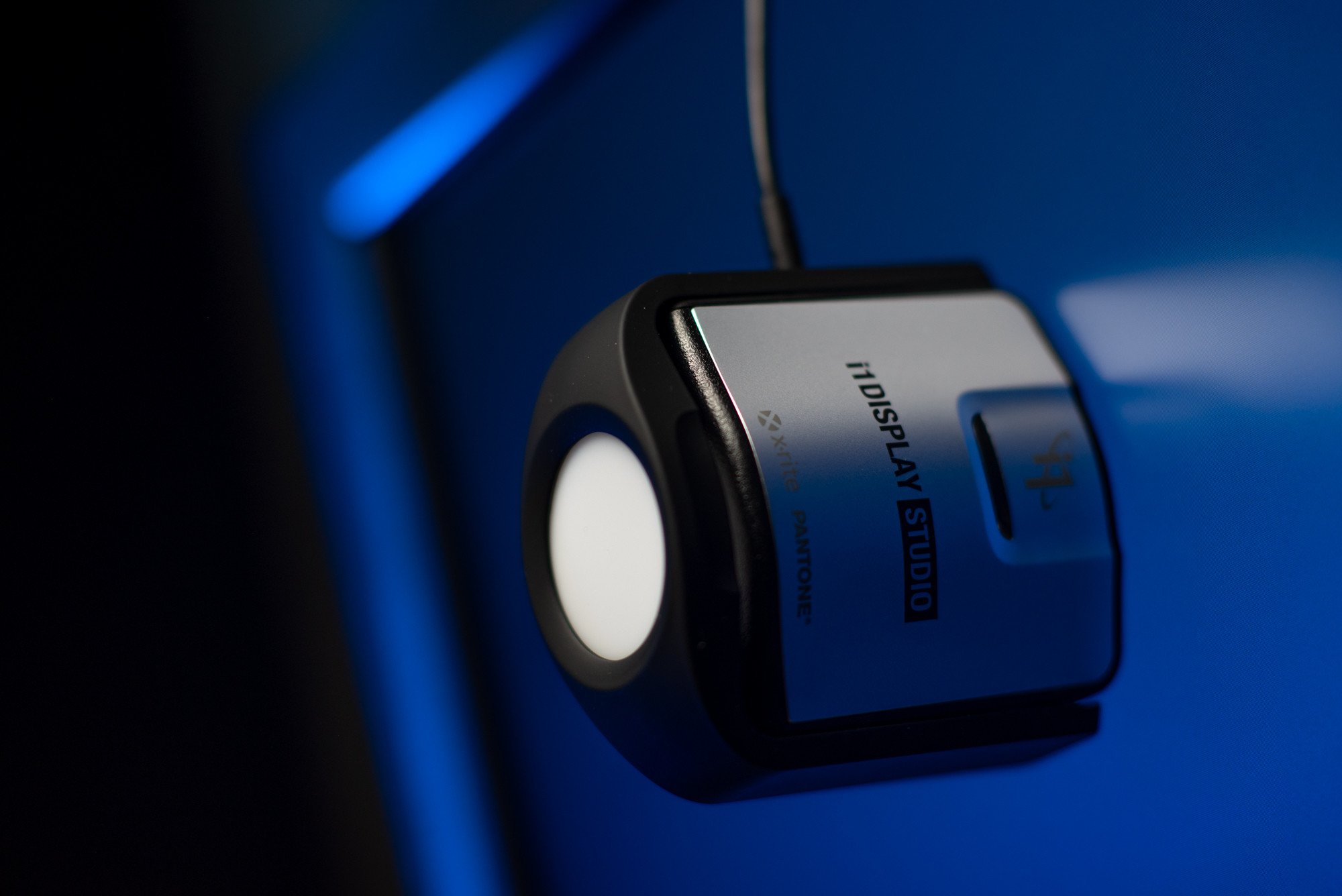
Calibrite ColorChecker Display, Pro and Plus models are just rebranded versions of X-Rite i1Display Studio, Pro and Pro Plus, respectively. Keep an eye on discounts for the previous versions. They use the same software and work exactly the same.
The monitor is usually the weakest link in the chain and benefits the most from calibration and selecting the right settings in the first place.
By using a calibrated monitor, it's possible to tame the most variable component in the color workflow and the biggest source for errors. Calibrating your screen ensures that what you see is consistent from day to day and any work based on it can be delivered with accurate colors, no matter the output medium, from the web to printed pieces.
I told I'd try to convince you to buy a monitor calibration tool, right?
Monitor aside, it's doable to work around the other components on the chain and get good results without committing to a fully color managed color workflow.
Input profiles are usually the least critical aspect in a color management system. Digital camera color is highly subjective and it's not really set in camera, but later on, on a computer monitor when adjusting the capture parameters and RAW files.
On the output side, printer profiles have come a long way in the past decade. Most high end inkjet printers drift very little from the factory calibration and offer good enough canned profiles for popular paper combinations.
Commercial printers usually follow a known standard and the best practice is to deliver files in the color space recommended, usually AdobeRGB for fine art inkjet printing. In other words, the output file is color-agnostic. It doesn't need to know how the printer reproduces color. That's the provider's responsibility and by using color management the file colors will be accurately reproduced by the output device as expected.
All in all, the most important thing is to deliver good quality and color accurate source files, specially in a world were most of our creative work is viewed on a screen.
Let's take a step back: Without spending any money, there's an easy way to get better color accuracy from our existing monitor, which is to make it follow a known standard as closely as possible.
2) Follow a known standard
More often than not monitors come from factory set up not to be accurate, but to look good on the showroom floors. Vibrant and punchy colors are generally far from accurate.
It's ok to enjoy a super saturated display for content consumption or gaming, but for creative work, photography, video, etc, the best color response possible is the most boring and repeatable one.
What we look for is a monitor that follows a known standard and help us to produce work that will look good on any other screen.
High quality displays are often very close to a known color standard, like sRGB or DCI-P3, and factory calibration is becoming more and more common.
Factory calibration doesn't eliminate the need for custom color profiles. That's a common misconception. What it means is that each piece of hardware is individually adjusted in factory and will deviate less from a standard than an uncalibrated model. In practice, we can trust the sRGB color preset on a calibrated monitor will be close to that matching color space.
Using the right settings goes a long way towards getting accurate color on any display. And investing a little bit of time on it pays off even when using a real monitor calibration tool.
Ideally we want the calibration process and resulting color profile to do the least amount of work possible for the best final results. It's always better to get it close as close as possible to the calibration target in hardware, instead of relying on the color profile alone for doing heavy corrections.
This strategy is similar to what colorists use to calibrate monitors for color grading. On the high end video world, the gold standard is to use a reference display that matches as perfectly as possible a known color standard. Some workflows don't even use color management.
It works, but with a few caveats
How good is good enough?
A properly configured monitor is much better than wonky one, but a properly configured and well calibrated one is even better.
The best place to draw the line is to think about the impact the monitor colors can have on your work. If it is absolutely critical to get the colors right, investing on an i1Display Studio can pay off on the short term.
If having a bit of color inaccuracy is acceptable, maybe that money will be better spent elsewhere. For example, illustrators often don't need to work with precise colors as everything is up to their creative interpretation.
One way to lessen the cost of a monitor calibration tool is to share it among a group of professional, rent or borrow it.
Based on my tests, modern monitors drift very little over time. For less demanding work, calibrating a modern good quality IPS monitor twice a year is perfectly acceptable for most use cases.
Laptop and integrated display limitations
Not all displays offer the settings necessary to adjust color response. Laptops, MacBooks, iMacs and most computers with integrated monitors offer only a single setting to adjust the luminance or brightness of the display's backlight. Color temperature, gamma and color gamut are locked at the factory setting.
Thankfully, computer monitors are getting better at each day and there's a noticeable market movement to adopt color accuracy as a selling proposition, specially on more expensive laptops and all-in-one computers like iMacs.
Most of those displays are close to the settings we want: 6500K white point with 2.2 gamma. Apple is at the forefront by adopting wide gamut displays with a DCI-P3 gamut on all devices.
If your display doesn't offer hardware controls for color, it's still important to adjust the panel brightness and match it to the working environment, as described below. Also remember to disable auto brightness, night shift and any other software function that can alter the display color response.
There are good inexpensive monitors at the $300 mark with factory calibration and advanced hardware controls, but that's not always an upgrade. Apple's newer wide gamut monitors are really good and will be noticeably better than a $300 one in terms of color gamut and resolution. For those cases, investing in a monitor calibration tool would make more sense.
How to
Here's a breakdown of the most important monitor settings for color accuracy and the suggested options for each.
Each monitor has different settings so there's no universal generic answer on what is the correct configuration, but there are guidelines that apply to every model.
There are 4 key settings available on almost all standalone displays: luminance, gamma, color temperature and color gamut. Let's focus on those.
1) Reset all settings
Step one is to reset the monitor to factory defaults and begin with a clean slate. It's also important to let it warm up for 30 minutes to ensure color response and brightness are stable.
2) Luminance or backlight brightness
The luminance or backlight brightness setting adjusts the intensity of the light projected by the monitor through the LCD layers that make each primary color. In other words, it controls how bright the monitor will look.
Our goal here is to match room and monitor lighting so both look balanced. For the best results in professional environments it's also important to match the room lights' color temperature and even the wall colors. Our eye adapts to the surrounding environment and all those factors can alter the perception of color.
Adjust the monitor according to your work environment and vice-versa. Focus on getting the room lightning right first, and then adjusting the display. Always try to use lights that are close to 5000K in color temperature, which is neutral and not overly warm, yellowish, or cool, blueish.
The ideal luminance range for color accurate work ranges from 80 cd/m2 to 140 cd/m2 or nits. But that's only possible to measure with a hardware device, either a colorimeter or spectrophotometer.
Without a colorimeter, the best guidance is to match monitor and room brightness in a way that neither looks too bright compared to the other. Always avoid cranking up backlight brightness too high unless there's a good reason for it.
Most people tend to run their monitors too bright and the recommended values may seem dim at first, but that's the range that can more closely match a printed photograph and the eyes quickly adapt to it.
Why are my prints too dark?
If you ever asked that, there's a high chance your monitor is set up too bright. Displays emit light and paper reflects it. It's easy to set up monitor brightness too high and overpower the amount of light a print can reflect to your eyes, making it look darker.
3) Gamma
Hey, don't look up monitor gamma correction on Wikipedia unless you're a physics major. Seriously.
The simple explanation is that gamma is a correction curve used to distribute the intermediate tones in an image. A gamma curve of 2.2 more closely matches our visual perception of tones and is the most common standard used for photo editing, design or general computer usage.
In the past, Mac computers had a default gamma value of 1.8 which matches more closely commercial printing, but nowadays MacOS uses gamma 2.2 just like Windows and most other operating systems.
Select the 2.2 gamma preset on your monitor on-screen display.
4) Color temperature
Along with backlight brightness, this is the most important setting to get right.
The short answer is: select the 6500K preset.
The long answer is a bit more nuanced.
Color temperature is measured in degrees Kelvin. The higher the value, the cooler and blueish is its going to look. Conversely, lower Kelvin values will look warmer and yellowish.
As a frame of reference, old incandescent light bulbs are around 2700K while cool white fluorescent tubes (think bad kitchen lights) are over 7500K. A cloudy sky in an overcast day is about 6500K.
It was very common 15 years ago for computer monitors to have high native white points, looking very cool compared to natural lighting, specially the first affordable LCD displays. LED backlights evolved a lot since then and most monitors nowadays are close to 6500K.
The most common monitor native color temperature, also called white point, is 6500K. That's the color temperature used on the two most popular standards for monitor color: sRGB and rec. 709 (ITU-R BT.709).
sRGB was developed by Microsoft and HP in 1990's and represents typical office or home viewing equipment and conditions. It has a small color gamut that can be accurately reproduced by almost all devices. Think of it as a minimum common denominator that all modern displays can cover.
Rec. 709, also known as Rec.709, BT.709, and ITU 709, is a standard developed by ITU-R for characterizing color response in HD television. It's the most common standard for video. Primary color coordinates are identical to sRGB, as is the white point at D65 (effectively 6500K), but the gamma curve is different.
The two most common wide color spaces, DCI P3 and Rec. 2020, used for HDR video, also follow the D65 white point.
What we want is to match those standards as closely as possible, thus the recommendation to select 6500K for the monitor white point.
Don't worry if you're working on a screen without color temperature controls, laptops or iMacs, for example. Most modern good quality LCDs are close to 6500K.
Using 6500K is a great starting point, but there are reasons to stray from it in special cases. For example, a slightly lower color temperature around 5500K can provide a better screen to print match for your particular work environment.
D65 or 6500K?
Wikipedia has a good article about the D65 standard illuminant and Parker Plaisted has a couple of articles going deeper into it.
For simplicity's sake, we can safely assume that the 6500K preset on the monitor is the one that will match more closely the D65 theoretical color used on those standards.
5) Color gamut
Monitor color gamut is the range of colors a particular display can produce. The wider the gamut, the more vibrant and saturated colors will look to our eyes.
Most standalone monitors have controls for color gamut. We'll usually find at least a sRGB preset and individual red, green and blue controls to run it on the unconstrained native gamut. Wide gamut displays often have additional options, such as AdobeRGB and DCI-P3.
Stick to the sRGB preset if not working on a fully color managed workflow. That option will be as close as possible to the sRGB color space, which is how all operating systems treat untagged images and devices without custom color profiles.
When using a monitor calibration tool it is advisable to select the native preset, or better yet, the individual RGB controls and have access to the full monitor gamut. The resulting ICC profile will accurately describe the monitor gamut so the OS and any color managed app can adjust the output and get accurate colors from it.
Setting up the monitor on a wide gamut preset, such as DCI-P3, but not using color management is the cause for oversaturated monitor colors. The operating system will treat that device as sRGB, but the actual gamut is much larger. In other words, a saturated red color on a wide gamut display is much more vibrant than on a sRGB one and without a custom ICC profile the OS cannot compensate for it.
On the other hand, calibrating a wide gamut monitor using a constrained preset such as sRGB leaves a lot of potential on the table by not using the full monitor color gamut.
6) Avoid the traps
Sometimes monitors offer dynamic modes that can alter contrast or color response based on the content displayed. That's a bad idea for color critical work and the opposite of what we want, which is having constant and repeatable color.
Disable any dynamic modes, like dynamic color or contrast, or even local backlight dimming, unless your monitor has a ton of backlight zones and can do a great job with it. Most don't.
Same for modes that cut blue light. On the same note, make sure to disable Night Shift and auto brightness modes on the MacOS settings and the equivalent options on Windows 10 with the Night light and auto brightness settings.
Do not touch the contrast control and leave it at the default setting. Changing contrast internally often means clipping the darkest or lightest tones, losing information from those areas.
Same for sharpness or scaling. Keep the default settings and always use the monitor at its native resolution.
Be careful with the HDR mode
There are several standards for HDR monitors and most of them fall short from offering true high dynamic range response.
HDR modes are fine for consuming content, watching videos and playing games, but often hurt color accuracy and our own tonal perception when creating content.
Video editors and colorists working on the larger Rec. 2020 colorspace might benefit from HDR monitors, but that's opening a whole new can of worms. If your work falls into this category, look into high end monitors that are VESA Certified DisplayHDR 1000 or higher.
For photography, design, illustration, web, etc, disabling HDR mode is a better choice 99% of times.
Neutral monitor color profiles
With the monitor hardware correctly set up, it's still necessary to inform the operating system about the color capabilities of that device.
That's accomplished by selecting the ICC color profile that represents the monitor, being it a custom profile generated by measuring the display with a monitor calibration tool or a generic one that matches it as close as possible.
If using the sRGB monitor preset, that means selecting the generic sRGB IEC61966-2.1 ICC profile in the Windows or MacOS display control panel.
It's also possible to use the manufacturer supplied generic profile for that particular monitor model. Windows tends to download and assign that profile automatically, while MacOS uses the monitor EDID information to generate a neutral monitor profile based on the hardware characteristics.
Either way, always test both options and see what it works best for your particular monitor. It's hard to say what will work best and, to be honest, we're flying blind without actually measuring the monitor characteristics.
Generally speaking, using the sRGB preset plus a generic sRGB colorspace profile are usually safer than using the generic manufacturer profile, which is often corrupted or contains calibration curves that will do more harm than good.
Is it possible to get pleasant and relatively accurate colors from any display without measuring it? Yes. But how good and if it's enough depends on each use case and monitor.